“世界上最美不过的景致,是那些最初的心动和不为人知。”
前言
好,诈尸博客
来补个前言,没想到又是教程
懒到没朋友
安卓第一课:用户界面
布局和控件
用户界面UI
UI即User Interface。手机屏幕上看到的所有东西都属于UI,而UI由控件(View)和布局(Layout)组成。
但是呢,布局只在敲代码的时候用到,而用户看到的全都是控件
因此先来学习控件
视图(控件)View
屏幕上的UI界面全由控件拼接而成,拼接的方式由布局决定(竖着拼横着拼等)
就像ppt的文本框一样,我们看不见他们的边框,但是它就是有边框(当然可以通过设置背景等方法看到)
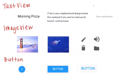
以下是一些标签的示例
- TextView:文本框
- ImageView:图片
- Button:按钮
这里可以看到他们的名字中既有大写字母又有小写字母,这就是驼峰命名法,详见附录1
动手敲敲TextView
每个控件,在代码中都是由标签来控制,这就是xml语法(所以控件和布局都在 .xml 文件中实现)
    <TextView
        android:text="Happy Birthday"
        android:layout_width="150dp"
        android:layout_height="75dp"
        android:background="@android:color/darker_gray"
        />
标签 的大体格式就是这样,
一对尖括号包住一个控件,开头是控件名,之后的是这个控件的属性名和属性值,最后带一个斜杠作为结束符号
以这两个属性为例:
android:layout_width="150dp"
android:layout_height="75dp"
这两个属性规定了控件的宽高,几乎所有控件都有这两个属性(废话,大家都要设定宽高)
android:layout_width 和 android:layout_height 是 属性名,而 150dp 和 75dp 是属性值
(dp是单位,表示独立密度像素;就好比px表示像素,具体见附录2)
宽高属性有三种设置方式:
- wrap_content表示默认大小,控件大小和文本大小相仿
- match_parent表示和父布局(parent)一样,父布局就是包着这个控件的布局,往下看就知道了
- 自定义长度,比如上面的50dp和75dp
当然还有背景框、字体大小、字体颜色,可以自己玩玩
注意涉及到颜色,除了统给我们定义好的(比如”@android:color/darker_gray”),我们多用RBG模式,比如”#aa00ff”,aa表示R(红色深度),00表示G(绿色深度),ff表示B(蓝色深度)。RGB实际上就是把三种颜色混在一起调和成新颜色。
    <TextView
        android:text="Happy Birthday"
        android:layout_width="wrap_content"
        android:layout_height="wrap_content"
        android:background="@android:color/darker_gray"
        android:textSize="30sp"
        android:textColor="#aa00ff"
        />
动手敲敲ImageView
ImageView和TextView非常非常非常相似,但有一点相信大家都能想到
ImageView是图片,那我的图片要放哪呢?ImageView要怎么找到我的图片呢?
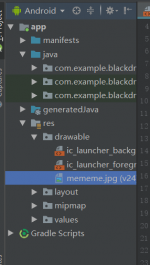
在左边的项目结构中,我们可以在res中找到drawable这个目录,res(resource)表示资源目录,图片、布局等文件都放在这里,而drawable就是负责放文件的。
第一步,我们把图片拖进来,注意,图片文件名一定要字母开头
第二步,我们在ImageView中,用他的src直接拿到这个图片(目录属性可以直接拿到drawable和mipmap下的图片,具体区别见附录3)
如果你的图片太大或太小,可以加一条“android:scaleType=”centerCrop””的属性,他会使图片放大或缩小至正好贴到屏幕
    <ImageView
        android:src="@drawable/mememe"
        android:layout_width="wrap_content"
        android:layout_height="wrap_content"
        android:scaleType="centerCrop"
        />
内边距padding和外边距margin
基本上所有控件都有这两个属性,他们也很常用
在应用中,控件和控件之间、控件和屏幕边缘总是相距一定距离
既是为了美观,也是为了误操作到其他控件(比如想按登录按成了注册)
而这就是由这两个属性实现
在预览视图中,我们可以看见,每个控件都有自己的框框,而内边距指的是这个框框到控件实体的距离;外边距指的是这个框框到其他控件的框框的距离
(有点类似前端css的盒模型,感兴趣的可以自己去看看)
具体用法如下:
android:padding="10dp"
android:layout_margin="10dp"
效果是这样的,能分出哪个是padding,哪个是margin不?
布局Layout
用户是看不到布局的,但是开发者要根据控件的排列方式来决定使用哪个布局
当然,布局也是有内边距padding和外边距margin的
线性布局LinearLayout
线性布局是最基础的布局,它将其中的控件横着或竖着排列
其由“android:orientation”决定排列方向,”vertical”表示竖直,”horizontal”表示水平,不设置的话默认水平排列
(上面一大堆我也看不懂的代码是新建时自动生成的,别理他)
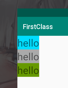
以android:orientation=”vertical” 为例,我们可以看到,即使每个TextView后面还有位置,LinearLayout也会把接下来的TextView放到下面
<LinearLayout
    xmlns:android="http://schemas.android.com/apk/res/android"
    xmlns:app="http://schemas.android.com/apk/res-auto"
    xmlns:tools="http://schemas.android.com/tools"
    android:layout_width="match_parent"
    android:layout_height="match_parent"
    android:orientation="vertical"
    tools:context=".MainActivity">

    <TextView
        android:layout_width="wrap_content"
        android:layout_height="wrap_content"
        android:text="hello"
        android:background="@android:color/holo_blue_bright"
        android:textSize="30sp"
        />

    <TextView
        android:layout_width="wrap_content"
        android:layout_height="wrap_content"
        android:background="@android:color/darker_gray"
        android:text="hello"
        android:textSize="30sp"
        />

    <TextView
        android:layout_width="wrap_content"
        android:layout_height="wrap_content"
        android:background="@android:color/holo_green_dark"
        android:text="hello"
        android:textSize="30sp"
        />

</LinearLayout>
(尝试将TextView的width和height改成match_parent,看看会发生什么)
相对布局RelativeLayout
还记得我们的LinearLayout,即使控件后面有空位,他也不会把下面的控件放到空的地方,而是下一行
如果想把控件放在空位上,这个时候就可以用RelativeLayout了
他的核心思想是:当前控件相对另外一个控件的位置(上下左右)
当我们仅仅把布局改为RelativeLayout,我们发现三个TextView只剩下一个了
(这个时候可以把android:orientation=”vertical” 也删了,这个属性在RelativeLayout中不起作用)
<RelativeLayout
    xmlns:android="http://schemas.android.com/apk/res/android"
    xmlns:app="http://schemas.android.com/apk/res-auto"
    xmlns:tools="http://schemas.android.com/tools"
    android:layout_width="match_parent"
    android:layout_height="match_parent"
    tools:context=".MainActivity">

    <TextView...>

    <TextView...>

    <TextView...>

</RelativeLayout>
这是因为RelativeLayout,不像LinearLayout,他默认将控件放在左上角,并且重叠放置(这也是android:orientation没用的原因)
这个时候我们要如何布局呢?
回到RelativeLayout的核心思想,如果要确定当前控件相对于其他控件(我们称之为兄弟控件)的位置,那么我们需要一个属性来唯一标识一个控件,毕竟兄弟控件是可能有很多个的
而这个唯一标识控件的属性,就是android:id
然后,根据id来决定,当前控件应该贴着哪个控件
<RelativeLayout
xmlns:android="http://schemas.android.com/apk/res/android"
xmlns:app="http://schemas.android.com/apk/res-auto"
xmlns:tools="http://schemas.android.com/tools"
android:layout_width="match_parent"
android:layout_height="match_parent"
tools:context=".MainActivity">
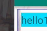
<TextView
android:id="@+id/text1"
android:layout_width="wrap_content"
android:layout_height="wrap_content"
android:text="hello1"
android:background="@android:color/holo_blue_bright"
android:textSize="30sp"
/>
<TextView
android:id="@+id/text2"
android:layout_width="wrap_content"
android:layout_height="wrap_content"
android:background="@android:color/darker_gray"
android:text="hello2"
android:textSize="30sp"
android:layout_toRightOf="@id/text1"
/>
<TextView
android:id="@+id/text3"
android:layout_width="wrap_content"
android:layout_height="wrap_content"
android:background="@android:color/holo_green_dark"
android:text="hello3"
android:textSize="30sp"
android:layout_below="@id/text1"
android:layout_toRightOf="@id/text1"
/>
</RelativeLayout>
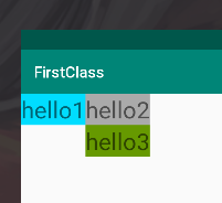
上面的text2中,android:layout_toRightOf=”@id/text1” 表示它在text1的右边;
而text3中,android:layout_below=”@id/text1” 和 android:layout_toRightOf=”@id/text1” 表示他同时在text1右边和下面(右下方)
值得注意的是,在RelativeLayout中,所有控件是默认在左上方的。所以如果不同时设置上下和左右的属性,可能会出现一些bug
比如我想让text3在text2的下面,仅仅设置android:layout_below=”@id/text2” 是不行的,因为没有设置左右的属性,因此text3仍然是默认地贴着左边
常用到的属性有这几种:
        在某控件左边:android:layout_toLeftOf="@id/id_name"
        在某控件右边:android:layout_toRightOf="true"
        在某控件上面:android:layout_above="@id/id_name"
        在某控件下面:android:layout_below="@id/id_name"

        在父布局竖直方向居中:android:layout_centerVertical="true"
        在父布局水平方向居中:android:layout_centerHorizontal="true"
        在父布局正中间:android:layout_centerInParent="true"
除了相对于兄弟控件的位置,我们还可以让一个控件相对于父布局进行调整,比如在左下角,在右边中间,在正中间等
具体属性如下,大家可以自己尝试
        贴着父布局右边:android:layout_alignParentRight="true"
        贴着父布局左边:android:layout_alignParentLeft="true"
        贴着父布局上面:android:layout_alignParentTop="true"
        贴着父布局下面:android:layout_alignParentBottom="true"

        在父布局竖直方向居中:android:layout_centerVertical="true"
        在父布局水平方向居中:android:layout_centerHorizontal="true"
        在父布局正中间:android:layout_centerInParent="true"
尝试同时在一个控件中设置android:layout_alignParentRight=”true” 和 android:layout_alignParentLeft=”true” ,或0同时设置android:layout_alignParentTop=”true” 和android:layout_alignParentBottom=”true” ,看看会发生什么
尝试同时在一个控件中设置android:layout_centerVertical=”true” 和 android:layout_centerHorizontal=”true” ,看看又会发生什么
视图组ViewGroup
有了控件和布局的概念,就可以很简单理解视图组了
视图组就是一个布局及其包含的若干的控件
而一个布局可以包含很多个很多个子布局,子布局中包含若干个控件,也就是说,布局是可以嵌套的
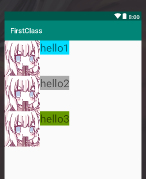
比如,单纯一个LinearLayout是很不方便的,但是我们可以用竖直排版(vertical)的LinearLayout嵌套水平排版(horizontal)的LinearLayout
我们来做三个视图组,每个都是横向排列的LinearLayout ,然后最外面包一个竖直排列的LinearLayout
<LinearLayout
    xmlns:android="http://schemas.android.com/apk/res/android"
    xmlns:app="http://schemas.android.com/apk/res-auto"
    xmlns:tools="http://schemas.android.com/tools"
    android:layout_width="match_parent"
    android:layout_height="match_parent"
    android:orientation="vertical"
    tools:context=".MainActivity">


    <LinearLayout
        android:layout_width="match_parent"
        android:layout_height="wrap_content">

        <ImageView
            android:layout_width="100dp"
            android:layout_height="100dp"
            android:src="@drawable/mememe"
            />

        <TextView
            android:id="@+id/text1"
            android:layout_width="wrap_content"
            android:layout_height="wrap_content"
            android:text="hello1"
            android:background="@android:color/holo_blue_bright"
            android:textSize="30sp"
            />
    </LinearLayout>


    <LinearLayout
        android:layout_width="match_parent"
        android:layout_height="wrap_content">

        <ImageView
            android:layout_width="100dp"
            android:layout_height="100dp"
            android:src="@drawable/mememe"
            />

        <TextView
            android:id="@+id/text2"
            android:layout_width="wrap_content"
            android:layout_height="wrap_content"
            android:background="@android:color/darker_gray"
            android:text="hello2"
            android:textSize="30sp"
            android:layout_toRightOf="@id/text1"
            />
    </LinearLayout>


    <LinearLayout
        android:layout_width="match_parent"
        android:layout_height="wrap_content">

        <ImageView
            android:layout_width="100dp"
            android:layout_height="100dp"
            android:src="@drawable/mememe"
            />

        <TextView
            android:id="@+id/text3"
            android:layout_width="wrap_content"
            android:layout_height="wrap_content"
            android:background="@android:color/holo_green_dark"
            android:text="hello3"
            android:textSize="30sp"
            />
    </LinearLayout>

</LinearLayout>
weight属性
有了视图组之后,有了一个新的问题,我要如何让几个视图平分屏幕、或者等间距分布在屏幕上呢?
当然可以给每个视图设置宽高,但这种方法只能在屏幕大小相同的设备上起作用。能不能让视图自己识别屏幕大小然后平分呢?
这就需要我们的android:layout_weight属性,weight表示权重,所以权重越大的控件,在屏幕上的占比就要越大
我们给每个水平排列的LinearLayout 加个weight
<LinearLayout
    xmlns:android="http://schemas.android.com/apk/res/android"
    xmlns:app="http://schemas.android.com/apk/res-auto"
    xmlns:tools="http://schemas.android.com/tools"
    android:layout_width="match_parent"
    android:layout_height="match_parent"
    android:orientation="vertical"
    tools:context=".MainActivity">


    <LinearLayout
        android:layout_width="match_parent"
        android:layout_height="wrap_content"
        android:layout_weight="1"
        >

        <ImageView...>

        <TextView...>
    </LinearLayout>

    <LinearLayout
        android:layout_width="match_parent"
        android:layout_height="wrap_content"
        android:layout_weight="1">

        <ImageView...>

        <TextView...>
    </LinearLayout>

    <LinearLayout
        android:layout_width="match_parent"
        android:layout_height="wrap_content"
        android:layout_weight="1">

        <ImageView...>

        <TextView...>
    </LinearLayout>

</LinearLayout>
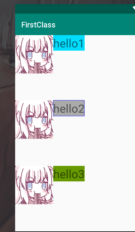
这时候会发现,三个LinearLayout可以平分我们的屏幕
如果调大某一个LinearLayout的weight,他就会占据更大的空间
附录
附录1:驼峰命名法
变量、方法、项目等东西的命名一直是代码规范中很重要的一部分,因此一开始要告诉大家
当然完整的代码规范我们还没写好,所以…以后再说呗
在安卓开发我们使用大驼峰命名法对类名和项目进行命名,用小驼峰命名法
什么是类先不用管,以后学了类和对象再说
比如TextView,它实际上是两个词,我们平时写的时候写“text view”,但是命名的时候是不给用空格的,因此我们用第一个字母大写来区别不同的词
大写的词好像骆驼的驼峰,所以叫驼峰命名法
大驼峰是指变量的第一个字母大写,即“TextView”;而小驼峰是指变量的第一个字母小写,之后的其他单词第一个字母大写,比如“textView”
我的项目名也是用大驼峰的,叫“MyFirstClass”
现在你们只用知道这个命名法就好,之后学了类和对象、方法等之后再给他用上。
附录2:单位
常见单位
px(pixel 像素):屏幕上的点,一般HVGA代表320x480像素。
in(inch 英寸):长度单位
mm(毫米):长度单位
pt(磅):1pt=1/72英寸,用于印刷业,非常简单易用
以上单位和设备分辨率有关,因此屏幕分辨率(屏幕大小)不同的设备可能会导致布局的错误/错位
与分辨率无关的度量单位
dp(即独立密度像素dip : device independent pixels):一种基于屏幕密度抽象长度单位
sp(与刻度无关的像素):与dp类似,但是可以根据用户的字体大小首选项进行缩放
因为dp和分辨率无关,不管你什么屏幕大小,多大的dpi,显示的效果始终保持一致
所以安卓开发首选dp作为单位(到时候记得提醒自己的设计师)
附录3:drawable和mipmap
drawable和mipmap都是安卓工程中资源文件下(res)的文件夹,而且都是存放图片的
区别在于,drawable中只有一个图片;而mipmap中含有相同的图片,不同的是每张图片的分辨率不同
(具体的mdpi、xhdpi、xxhdpi啊啥的自己去看啦)
在apk安装的时候,mipmap-xxx/下的所有分辨率的图片都会保留,而drawablexxx/下的图片只有保留适配设备分辨率的图片
当图片涉及动画效果的时候(比如放大缩小),最好用mipmap的图片,系统会根据图片大小选择合适分辨率的图片
而drawable中的图片……就只是一张图片